Basically, how it works is, the population is divided between 3 groups: susceptible, infective, removed. You then have a set of differential equations that describe how the sizes of those groups change over time. And from that you can get a decent prediction of how a particular disease will spread, how far it'll spread, whether it'll go epidemic, and so on.
Simple Model
So the simple model looks like this

Susceptible - anyone on Twitter who doesn't and hasn't ever followed you. Group size = S
Infected - Anyone who follows you. Group size = I
Resistant - anyone who has unfollowed you. We assume that there's a chance, however small, that they might follow you again. Group size = R
The total population size, N = (S+I+R)
You then have these terms for how many people move between each group in a given time period:
fS - some proportion of the susceptibles will follow you, say 1 in 10,000. So those people will move from S to I. And importantly, the exact number of people moving will decrease over time (as the size of S decreases).
Here, the proportion, f, is based on the chance of any given user randomly coming across you and deciding to follow you. Obviously this will vary from person to person, but we assume it can be averaged and still give a suitably accurate prediction. It's also loosely based on your 'attractiveness' as a user, so could be described as your 'followability'.
uI - the proportion of your followers that will decide to unfollow you, say 1 in 1,000. So as your number of followers increases, the total number of unfollows at a given time will also increase. But the proportion of unfollows stays the same.
The proportion, u, can be thought of as (the inverse of) your 'retention rate'. And that'll be based on, for example, how quickly people get bored of you.
rR - every now and again, someone who unfollowed you will follow you again, say 1 in 100,000. Whether that be because they forgot they already followed you or they decided to give you a second chance or whatever. It may be uncommon, but it's worth including in the model, because it does happen.
Behaviour
And from all this, you get a system of differential equations,

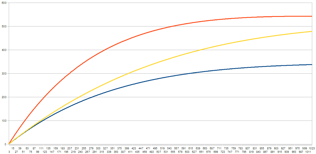
But with a bit of code, you can model the system's progression over time. And from that, you get follower curves like these; with a population of 1,000 and varying follow rates

Limitations
But the yellow one reaches a peak, then slowly starts to drop. This is because the number of people who haven't already followed yellow is almost 0 - i.e almost everyone has followed them at least once.
And there in lies the problem. As it turns out, this system will eventually reach a point where S is empty, and the sizes of I and R become constant (a stationary point). This happens when I = (r/u)R, and how fast it happens depends on f.
In other words, for the above curves, since u and r aren't varied they will all stop when I = 250 and R = 750. The only difference is how quickly that happens.
But you could say it's sufficient over relatively short periods of time.
Improvements
First of all, the above model assumes the population (N) is constant - that is, that accounts aren't created or deleted. And obviously this isn't true, so it needs to be included to get a more accurate model.
So we introduce a birth rate, b - how many new accounts are created per unit time, assuming that any variation over time is relatively small. If the changing birth rate is significant and predictable, then it can be easy enough to account for. But for simplicity, we'll assume it's constant.
We also introduce a death rate, and for this we have two possible approaches:
- Either we assume that some proportion (1 in 10,000 or whatever) are deleted in a given time period.
- Or else, we assume a given, relatively fixed, number (say 100 a week) are deleted.
It's a question of whether death rate is constant, or proportion to number of users, and it's a quality of Twitter that you'd have to measure to find out. For simplicity, though, we'll say it's a proportional rate, value d.
The other thing to consider is the effect of the followers you already have - for example, new followers through friends of friends, or through increased exposure as a result of Follow Fridays, retweets, mentions, etc.
Now, as anyone who's used Twitter for a long enough period knows, #FFs don't actually have much effect, almost to the point of being insignificant. But it's still worth including, even if it's given very little 'infective power'.
And this is more like epidemiology, in that the more followers (infectives) you have, the more people there are to 'pass you on' to others. So we introduce a new term,
mI*ln(S) - where ln() is the natural logarithm function. This is important because for a large population, S, (as in the real world) if we didn't take ln(), this term would quickly over-power the rest of the model and follower numbers would grow very large very quickly.
m basically measures the ability of your followers to pass you along, which again is affected by how 'awesome' (or otherwise) you are. But at the same time, if your followers aren't the types of people who RT or FF or whatever, then your awesomeness becomes irrelevant.
Updated Model
So the new model looks something like this,

Here are some example curves,
The orange one doubles f (keeping everything else the same). And you get the same sort of shape; it just grows faster and levels off higher.
The yellow is the same as blue, but with m doubled. And it falls somewhere in between the previous two - albeit less curved - but doesn't have the same levelling off (within the range of the graph).
Basically, the behavior of this model in most cases goes like this:
- Followers (I) will grow at a rate based, mostly, on the values of f and m.
- It will typically (eventually) reach a point where it's growth slows, almost to the point of not moving for long periods - it becomes pseudo-static - but ultimately it is still increasing.
- The point at which it reaches that pseudo-static state and how high it goes will depend on the variables (f,m,u,r), which is ultimately, relatively unique to each user.
Some other things to consider as well,
- In general, the birth rate is greater than the death rate. But by using a constant birth rate and proportional death rate, you find the population eventually stabilises and becomes constant at N = (b/d). But this is only a problem is the real-world death rate is proportional.
- As far as I know, this model doesn't have any stationary points. But then again, I didn't check. If they do exist, I imagine only the most popular celebrities will experience them. And that's only if the population becomes constant or starts to decline.
In the Real World
So this is still just an approximate model of follower growth. In the real world, you get a lot more 'noise' - one day you might get 3 new followers, but it could turn out they're all spam bots, and over the next week, they disappear one by one. This model essentially averages out that noise.
If you wanted to simulate this behaviour, you can add randomness into the (code) model. But as with the real world, it's ultimately just noise and not really necessary.
So the behaviour of the model may not be as rich as in the real world, but it's 'close enough'.
Other things that aren't accounted for are the fact that variables may change over time. Instead, we assume that their variation is insignificant and can be averaged out. The only time the change would really become significant and worth accounting for is if you suddenly became 'famous' (internet famous counts). But for most people this is not a concern, and more importantly it's not predictable.
The other thing you could add separately is the effect of following people (who don't already follow you). This is typically sporadic. But what you can ultimately do is say, for example, that you follow (on average) n people per week, and that there's an average 50% chance those people will follow you back. And once you've worked that out, you can just factor that value into f.
Usefulness?
If you want a vague idea of how your account's going to grow, this model should suffice. The variables you can get from measurements of your real-life follower growth so far. And from that you can get an idea of when you'll reach your pseudo-static point, and what that point will be (assuming you aren't already there).
But what's perhaps more interesting is if you measure people's personal variables. That way you can assign everyone values for 'attractiveness', 'retention rate', etc. And what you get is a new way to quantify a person's worth, or Twitter quality.
And as a final note, this model doesn't really apply to Facebook since FB doesn't have the follow mechanism, and because you're not getting connections from random people. It would, on the other hand, work for Tumblr, (with possibly some minor adjustments), as well as other sites with a similar follow mechanism.
Oatzy.
[Pro tip: people like to be able to put a number on how much better they are than their friends.]
Flowcharts created with free, online app Lucid Chart
No comments:
Post a Comment