Showing posts with label flowchart. Show all posts

Thursday, September 18, 2014

#IceBucketChallenge - A Viral Campaign

I know this blog is a little late to the game. In fact, I started writing it while it was still relevant... but then I got distracted. Such is life.


Background

You probably already know (or vaguely remember) what the Ice Bucket Challenge is. Basically if you're nominated you have to dump a bucket of ice water over your head, or else you have to donate money to some charity - most commonly ALSA, the Amyotrophic Lateral Sclerosis Association.

You then nominate 3 more people, who have 24 hours to do the same thing. In some variants, you also make a small donation even if you dump the ice water over your head, or else you make a bigger donation if you don't (some specify $100).

Anyway, what I was interested in is how the challenge spread - this was a 'viral' campaign in a very true sense. So why not try to model how the campaign spread as we would model the spread of a virus?


The Viral Model

I've written about this sort of thing several times before. The basic idea is this - the population is divided into three groups:

Susceptible (S) - The population that hasn't been exposed to a disease/virus, but is susceptible to infection
Infectious (I) - The people who have been exposed, and can infect other people
Recovered (R) - The people who have been infected, but have recovered. It's generally assumed that these people can't be re-infected. (But there are variations).

For the ice bucket challenge, we can look at a direct analogy as

S - Those who haven't been nominated
I - Those who have been nominated and are taking the challenge (so can nominate other people)
R - Those who have completed or those who declined the challenge (and can't nominate anyone else)

We can draw the model as a flowchart, showing how people move between the different groups,

Here, we've divided nominees into those who accept the challenge (S->I) and those who don't accept (S->R). So, now we can describe the model as a system of differential equations,


Where the factors (α, β, γ) describe what proportions of each group move to where.

The most interesting part is the 'S*I' terms in the first two equations - this basically says that the number of newly infected people is proportional to the number of susceptible people AND the number of infectious people.

This makes the system self-limiting, meaning that the number of infected people can't just grow to infinity - since that's not what we observe. Instead, what we see is an increase to some maximum, followed by a steady drop-off. For example,

We don't have hard data on how many people did the challenge over time, but we can get an idea of what happened by looking at the YouTube search numbers for the phrase 'ice bucket challenge' (above, via Google Trends).

I mean, it seems reasonable to assume some loose correlation between the number of people doing the challenge, the number of videos of people doing the challenge, and the number of searches for those videos. Searches peaked on August 21st, in case you were wondering.


A More Discrete Model

The downside to this 'S*I' term is that it makes the equations non-linear, meaning they can't be solved analytically - that is, you can't come up with an 'exact' equation for the number of people doing the challenge on a given day, for example.

But we can do a numerical simulation, instead.

In fact, this is a more reasonable way of looking at the system, since we're interested in a discrete time step of one day - i.e. the 24 hours nominees have to complete the challenge. For the simulation, we're also going to rounded the numbers of people in each group (after each time step) to whole numbers, since you can't (or shouldn't) divide a person into fractions.

Now, we need to define some parameters. First of all we need to define our start populations. We'll call the initial susceptible population S0 - this could be, for example, the Earth's population (which was around 7.16bn when I ran my simulations). We'll assume that one person is infected as a starting point  - the originator of the challenge (I0 = 1). And we'll assume that no-one else has done the challenge at the start, so R0 = 0.

For the constants (α,β,γ), the easiest one to define is γ - the 'recovery' rate. We assume that after the 24 hour challenge period nominees are no longer 'infectious', therefore γ = 1.

For α and β, we have the total rate of infection/nomination defined as (α+β). We're given that each challenge completer gets to nominate three new people, so we can define (α+β) such that in the first step (when there's only one infectious person) we have (α+β)*S0*I0 = (α+β)*S0 = 3. Therefore (α+β) = 3/S0.

Now, α and β are related to the proportions of nominees that accept and decline the challenge, respectively. So we can redefine the constants as α = a/S0 and β = b/S0, such that (a+b) = 3, or alternatively α = a/S0 and β = (3-a)/S0. So now we can look at 'a' as the average number of nominees who accept the challenge.

So to tie it all together, we have the system of (difference) equations,

And it's pretty straightforward to write some code that'll run through those equations.


So we've got our model, what now?

Having a model is all well and good, but why bother? Well, now we can start asking questions. For example, how fast does the campaign spread? How long will it take for the challenge to die out, and how many people will have taken part by that point? And what happens when we change the number of people who accept the challenge?

First of all, if we run the simulation (with a = 2.5) and plot I(n) - the number of people doing the challenge on any given day - we get something like this


[where I(n) has been normalised so that the maximum is 100, as Google Trends does].

This is about what we expected - a rise and a fall. Though it's worth noting the shape is a little different from the YouTube searches above; the simulation drops off quickly, while the search numbers have a longer tail. This could be because, even after the challenges are done, there's a latent interest in (re)watching the videos. Or it could just be that this model is not entirely accurate...


So what happens when we vary 'a'?

We can start by assuming everyone accepts the challenge (a = 3). In this case, eventually everyone in the world does the challenge - specifically within 21 days of the first challenge. But that isn't very realistic.

So let's say that on average 1.5 or 2 of those challenged accept. In these cases, the ice bucket phenomenon ends before everyone can be challenged. For a = 2, the challenge ends after 50 day, with ~13% of the population going unchallenged. On the other hand, for a = 1.5 the challenge takes significantly longer to end (over a year).

In fact it turns out that for any a < 1.6030165.. the challenge will take a significant amount of time to end - the number of 'infectious' people will eventually reach 1, and stay there until S <= S0/(2a) (remember we're rounding each group to the nearest whole number). For a <= 0.5 the challenge ends almost immediately.

Now, we know that for a = 3, the population S goes to zero (everyone is challenged), whereas for a = 2 the challenge stops before S can go to zero. So we have the question - what is the smallest value of 'a' for which S goes to zero? If you do a bit of interpolating, you can figure out that this critical value comes out at around 2.7405349.. At this value of 'a', the challenge ends after 23 days. In other words, if on average 2.74.. (~91%) of the people nominated accept the challenge, then after 23 days everyone in the world will have been challenged.

From what I've seen myself, it seems like nearer 1 in 3 people accept the challenge on average. So, as viral as the campaign was, it was never going to take over the world.

If you play around a bit, you'll find that the critical values of 'a' are dependent on the initial population (S0). But, as far as I can tell, it's not possible to derive these critical values analytically. (Answers in the comments if you can prove otherwise).


Why wait to be nominated..?

At this point, you're probably thinking this isn't a very realistic model. And you'd be right. So lets make it a bit more complicated.

In particular, lets add spontaneous participation - that is, people who aren't directly nominated, but who see all the other people doing the challenge, and decide they want to take part too.

We'll assume that this participation is proportional to those who have already done the challenge (I and R). So to start with, we need to separate the 'recovered' group into those who actually did the challenge (R), and those who declined (D).

The new model looks something like this,


With difference equations,

In the flowchart, we've introduced this new factor 'δ', the 'inspiration' rate. If we re-define it, like we did for the infection rate, as d/S0, then 'd' can be loosely interpreted as the average number of people inspired to take part by each person who's already done the challenge.

Now we can look at how this 'd' factor affects the things we looked at before - how long it takes for the challenge to end, etc.

Let's start by assuming that the average number of nominees accepting the challenge, 'a', is 1 (out of 3). What value of 'd' do we need for S to go to zero? Do a little interpolating again and you get d = 0.8668653 - that is, if each person who pours a bucket of water over their head inspires (on average) 0.867.. people to do the same, then everyone in the world will participate, within 26 days of the challenge starting. For a = 2, we need d = 0.4046021 for S goes to 0. And so on...

What's a plausible inspiration rate? For a normal person, probably zero, while for a celebrity... I don't know. But on average 'd' is probably very close to zero. I mean, we know for a fact that significantly less than the entire population of Earth has been nominated/taken part in the challenge.

If you plot I(n) for a = 1 and d = 0.1 you get something like this,


In this case, you have that same rise and fall - but this time, you have a longer tail, like we see in the YouTube searches. Is this proof that this iteration of the model is more accurate? Maybe. But as I pointed out before, the YouTube searches don't necessarily accurately represent the number of people taking the challenge over time.


Social Pressure

When a friend does a thing for charity, then publicly calls you out to take part, there's a certain amount of social pressure to comply. I mean, if a friend dumped water over their head (just because), then asked you to do the same thing, probably you'd look at them like they were a crazy person. Anyway, that kind of social pressure is implicitly included in the 'infection' rate - more social pressure, bigger 'a'.

Instead, the sort of social pressure I'm talking about here is the kind that goes: "I should accept the challenge because so many other people have already done it". Or alternatively, "it's okay for me to accept the challenge, since so many other people have already done it".

In other words, the more people accept and complete the challenge, the more likely a nominated person is to accept too. Mathematically, we can introduce this with a term in 'S*I*R'. Or alternatively, we can keep the term as 'a*S*I', but make the factor 'a' a function of R -> a(R).

Anyway, if you're interested, you can try investigating that yourself. Or try adapting the model in some other ways. But beyond a point you can end up complicating a model more than improving it.


A Network Theory Approach to Nominating

So I was eventually nominated for the challenge. But I'm a wimp, so I declined to dump ice water over my head, instead making a donation to the Motor Neuron Disease Association (the UK equivalent of ALSA).

For my nominations, I wanted to try and maximise spread. So I nominated the 3 of the people in my Twitter network who are the most active and well connected, and who I thought would be up for accepting the challenge. Plus, as a secondary effect, I figured they might nominate other people in my Twitter network - the network theory equivalent of wishing for more wishes.

In the end, one ignored the nomination, one acknowledged but didn't accept, and one accepted (in the form of a donation) but didn't nominate anyone else. So I guess that theory didn't quite pan out. But I did at least encourage more charitable giving.


So Yeah

If we had real world data we could maybe test the accuracy of these models. But even without, we can get a sense of how the challenge behaves - for example, we find that there's a critical 'challenge acceptance ratio' that determines whether the viral campaign will go 'pandemic'.

In theory, you could apply this sort of model to any viral campaign, or just anything that spreads 'virally'. The nice thing about the Ice Bucket Challenge in particular, though, is that it has well defined rules for how the challenge spreads from one person to the next.

So, yeah..


Oatzy.


[I need an editor, my pronouns are all over the place.]

Sunday, July 24, 2011

Tumbling, Appendix II: Getting Formal

Pre-Ramble

The problem with what I've described previously is it's all a bit fuzzy - it's based on flow diagrams and vague descriptions, it was informal, and lacked precision. Mathematics, however, likes to have ideas clarified, by transforming them into precise, but somewhat impenetrable, collections of symbols. And who am I to argue with maths?

Having found PlosOne and arXiv, which offer open-access to academic papers, I've come across a few papers - some related to subjects in my blogs - that have grabbed my interest. And usually I'll skim over them, then download for reading 'at a later date'. But even just skimming, I have started to picked up a few tricks

Being as this is just an informal blog, there's nothing wrong with being informal. Nonetheless, there's no harm in a little practice. So this is an attempt to reintroduce the model (derived previously) as a formal set of equations. It should be noted, though, that none of this changes or nullifies what was previously written. It simply sets it out in a more precise - albeit cryptic looking - way.

Consider this fair warning of what's to follow.


But First...

For completeness, I wanted to redefine the model as a compartmental one. For what it's worth. It would look and work something like this
In this case, alpha roughly reflects the average number of followers a user has, and beta the approximate average reblog rate. (gamma = 1 - beta). As discussed previously, this model isn't really sufficient. But it's nice to look at for comparison.

In fact, the exposed state (E) isn't strictly necessary in this case (more on that below). It's more of a placeholder, included for clarity. You can actually rework the model to get rid of it; in which case, it looks like this
Here's an example of what the output might look like (N=10,000, alpha=0.001, beta=0.14),
With the compartmental form of the model, because the variables - such as the reblog rate - are constant, the behaviour across multiple simulations is uniform.

In fact, for the same initial conditions, the results will always be the same. By comparison, the behaviour of the model previously outlined can vary wildly between multiple simulations, run with the same initial conditions.

You could modify it - maybe make the variables, literally, variable - but since we already have a perfectly good model, it's not really worth bothering.


Preamble

First of all, these are difference equations - as opposed to the differential forms used above. This is because we're working in discrete steps (rather than continuous), and because the equations aren't, strictly speaking, time dependent.

Second, for this formal approach, we're working in matrices. It's just easier that way.

Now. For the simulated model, I created the network at random, as I went. This was on the assumption that it would be computationally faster. But for formality, we suppose that the entire network is either known, or else generated prior to simulation.

At any rate, it works like this - define a matrix, M, with entries,
This is, essentially, a table of ones and zeros that represents some (arbitrary) network of connections - i.e. who follows who.

As an example, in the below, the matrix on the right represents the graph on the left,
From this, we can calculate things like: the number of people a user, i, follows, and the number of people user i is followed by (respectively) as
That is, in the left case, sum along the i-th row, and in the right, sum down the i-th column.

Next, we define column matrices for each of the possible states. So, for example, the susceptibility matrix, S, has entries
That is, if user i is susceptible at time n, then this will be indicated by a one in the i-th row of that state matrix. Otherwise its value is zero.

We can then define an operator to calculate the number of people in that given state as
Essentially, this counts the number of ones in whichever state matrix. Which leads to the equation
Which basically says that the sum of the number of people in each state equals the total population size.  Or in other words, that everyone in the population has to be in one of the three states.

Finally, we define a function, sigma, that looks like this,
This is the function for threshold testing, described previously. In essence, it takes a matrix of the users' thresholds, t, and their assessments of a given post, A(p), and returns a matrix of ones and zeros representing whether or not each user will 'reblog' that post.


The Model

So now, we can define our set of equations. Brace yourself,
The typical initial conditions will be,
In theory, this model shouldn't be significantly different from the one previously outlined - though, admittedly, I haven't tested this assumption.

Ultimately, the behaviour of the system depends on the matrices M, t, and A(p). And if these are predefined and fixed, then the behaviour will be the same over multiple simulations. But if these are newly generated (at random) for each simulation, then the behaviour will be variable, as before.

In this case, E(n) is really more a function, upon which the other equations depend, rather than a state in and off itself. In particular, no-one exists in that state for any longer than it takes for them to be redistributed into their proper state (for that iteration). This is similar to the redundancy of the E state in the compartmental model above, except that this time it's not so easily written out.

And that's basically it.


Oatzy.


[Hoping I didn't make any mistakes in my own model.]
Wednesday, June 29, 2011

Tumbling, Appendix I: Making Connections

Where Things Get Interesting

Recall in Part 3 (under 'Notes and Improvements'), I mentioned the possibility of creating graphs of how a post spreads - ie who reblogged who.

As it turns out it was possible. And in fact, not that difficult.

You can find the modified code here.

In addition to the outputs the previous iteration generated, this updated version also creates a 'graph.csv' file, which contains all the links between reblogging users. This file can then be imported into, for example, Gephi, to create a visualisation of the graph.


Modified Model

The updated model works thing like this
We have the set, F, of people who reblogged in the previous generation. For each of these users we iterate over their followers, with the reaction code as before.

But we now have the addition that, if the follower reblogs, a new property - user.reblogged - is set to the person they reblogged from. That (reblogging) user is then added to the temporary group f_i to be used in the next iteration.

The simulation ends when f_i is empty - ie, no-one reblogs.


Pretty as a Picture

So, keeping the initial conditions the same as for Part 3, here is an example output
And here if the accompanying 'spread over eccentricity' graph.
Compare for those visualisations in Part 1

I have to say, I am extremely pleased with this. I mean, just look at it! It's amazing.

Here's another example
And finally, here's a graph for a population size, N = 20,000 & f0 = 1,000
More reblogs overall, and lots more clustering in this case. Pretty awesome, right?


Little Niggles

The only things that really bother me now:

1) The Like count seems a little high
This is probably a result of the distribution/variables chosen in creating approval thresholds.

2) There's only a small number of reblogs coming from OP.
This relates to the 'reblogs from tags' thing discussed in Part 3.

3) Small population
At some point, when I've got the time to run the simulation, I'd like to try it with larger populations/larger f0

But none of these things bother me too much, and I'm pleased with what I've got.


So that's basically that.


Oatzy.

Tuesday, June 28, 2011

Tumbling, Part Three: Stochastic Spread

No SIR

So having written the previous posts, I was wondering if this spread could be modeled. We could use the SIR equations, but this runs into the problems I mentioned before - i.e. it assumes regular infection rate, approximately uniform population distribution, etc - and as the graphs showed, this is not the case with Tumblr (or Twitter, for that matter).

There are, in fact, modifications to the SIR model to make it work with irregular population distributions. But I'm not entirely familiar with these, so I'm kinda going my own way with it and hoping for the best.

I should point out that, while SIR models are typically time linked, in this case we're working in 'spread over eccentricity' (as discussed in Part 1). The effect of this is that the model won't reflect real-time spread, but rather how wide and far from the source it goes.


Scattered Clusters

The majority of users will have between ~100-200 followers. The numbers of 'leaders' then decreases exponentially as the follower counts get bigger - with very few users having follower numbers in the thousands. Or so I'm choosing to assume; I have no data to support this.

So for this model, the users' follower counts are generated randomly using a log-normal distribution.  This seems like the most plausible fit for the real-world.


For the implementation of the model, all users are generated prior to the actual spread simulation - creating a 'user pool' of the entire population (size N). Users are then randomly select from this pool as and when needed.

Pre-generating the users creates consistency, and makes it easier to keep track of who has already seen the post - assigning a new property to each user, user.exposed, which equals 1 if they have seen the post, and 0 otherwise.


Model Mechanics

You can download the code for the completed model here (Python)


So the basics of the model work like this:
Starting with the original poster (OP), who has F = f0 followers:

a) Select F users at random from the 'user pool'

Then, for each user:

i) Has that user already seen the post?

If no,

ii) How does the user react to the post?

Ignore, like, reblog? Increment counters accordingly.

This bit of code is essentially the same as that discussed in Part 2 - using the 'per-person' approach. We also introduce a new counter, eReblog, which keeps track of the (cumulative) number of reblogs at each level of eccentricity.

iii) If a user reblogs, add their follower count to the 'follower counter' (fi)

This is something of a corner-cutting method - the follower counts for all reblogging users are mixed into the same counter. Since some of the follower groups might overlap, users are selected from the pool with replacement to compensate.

This method is perfectly fine, so long as we don't want to create graphs of who reblogs who. And for simplicity, we don't.

b) If fi = 0, end simulation. Else, go back to (a) with F = fi

Termination condition - obviously, if no-one reblogs the post, there's no need to go any further.

That's basically it.


Initial Conditions

Population = 3,000; F0 = 150, Threshold Ranges: [4,11], Post Quality: No(3,2), Followers: Log-No(5,2)

Obviously, the population of Tumblr is much larger than 3,000. But this code starts to struggle when you get into the 10,000s, so if we're too impatient to wait much more than a minute for results, we have to make concessions . Not that that should have significant effect, other than the population being exhausted quicker.

The post quality has been set low, and the thresholds high, so that the spread doesn't instantly explode and burn out. This makes the results more interesting to observe.


Reassuring Results

Below is a graph of seven example outputs of the model - ALL with the same initial conditions.
Note the wide variation in behaviour. This is really the sort of thing I wanted to see.

In particular, I like 'Row 8' (dark purple) - the way it stays fairly low, then has a sudden burst at generation 4 - similar to what happened with the Dr Who image in Part 1 (albeit with only one burst).

We also have, in 'Row 2' (red) a spread that starts to die out immediately, as with the HIMYM image (also mentioned previously).

One result not graphed, because it can't be, was an example outcome where the post didn't spread at all (ie 0 reblogs) - which is not an uncommon occurrence in the real world.

While we're at it, here is graph for the average of all the lines in the previous image
I would guess, if you averaged many more sample outputs, the curve would even-out into a single hump.

For comparison, here is what the graph looks like when the post quality is higher, and the approval threshold on a wider range
Basically, a lot of reblogs over a very short space of time. Which, as mentioned above, was why I set the initial conditions lower.


Shape-wise, these graphs don't seem to differ significantly from those you'd expect to see from a SIR model. Not identical - there's certainly much more variance from this model - but it's interesting to see all the same.

Finally, if OP is 'Tumblr Famous' - that is, has 1,000 or more followers - this model would seem to suggest that their larger follower count has little effect on how far a post (subject to our initial conditions) would spread. This seems strange.

That being said, if we're using a population size = 3,000 , then an OP starting with 1,000 followers means that a third of the population is exposed and used up right away. So further investigation is probably needed on that one.


Notes and Improvements

So this model works, and is pretty good. But it's by no means perfect.

1) The Problem With Approval

Behaviour of super-node may vary from that of normal people - eg more exclusive, selective, etc - but for simplicity, this is ignored. That said, if true it wouldn't be too hard to have approval thresholds dependent on, for example, follower count.

2) Reblogs From Tags

Some people discover via their tags - or for that matter, through search engines - rather than from the people they follow. If we were desperate to incorporate this into the model, it could be as straight forward as picking extra (unexposed) users when choosing from the user pool.

3) Didn't See It

Some people just don't see the post, or don't see it til much later and from someone else. But we can assume that the former are indistinguishable from those who did and ignored, and can ignore the latter.

4) Who Reblogged Who

We'd have to replace the part of code where the reblogs are grouped into a single counter with code that has some sort awareness of who each user reblogged - see Appendix I

And while we're at it, we could also build up a graph off how all these users are connected - ie, a who follows who graph. But that's not necessary.

5) Fine-Tuning

For this model I chose the random distributions and variables arbitrarily, but based on educated guessing. Obviously, this is not ideal. For the best model, we'd need to tweak these to closely match real-world data. Sadly, I don't know where this data would come from.


What Use Is This Anyway?

The thing is, the advantage of the SIR models is that they can be solved exactly when looking for stationary points, or what initial conditions would lead to an epidemic, etc.

This is not the case with our stochastic model. Instead, we're left having to just play with the variables and observe the resulting behaviour. We could also modify the code to allow predefined variables to remove some of the randomness.

One other way the model could be used is, for a fixed set of initial conditions, repeat the simulation a significantly large number of times and look for the most likely outcome, as per the Monte Carlo method.

And as mentioned above, a similar model can be used to model spread of information through any network - including Twitter. It's just a matter of tweaking variables.

Anyway, the model serves its purpose as is, and I'm pleased with it. So yeah.


Oatzy

Wednesday, April 20, 2011

Markov's Next Tweet

Have cookie. All is a little intrusive So close to be Everyone is we haven't blogged in mall bathroom -!
If you've ever taken the time to read spam - and you really should - you might have come across something like this; text that almost seems human, but on closer inspection just doesn't quite make sense.


Markov Chains

I've mentioned Markov Chains before, for example, in the Snakes and Ladders post. Here's the formal definition from Wikipedia,
A Markov chain, named for Andrey Markov, is a mathematical system that undergoes transitions from one state to another (from a finite or countable number of possible states) in a chain-like manner. It is a random process endowed with the Markov property: the next state depends only on the current state and not on the past.
In the context of snakes and ladders, this basically says that the square you'll land on in the next turn depends on the square you're currently on, and the roll of a dice.


What the Dickens?

So what does this have to do with text generating?

Here's a visual example of how it works. These are the first few lines from A Tale of Two Cities as a flowchart,
In the above, you have the lines broken up word-wise, and linked by which words follow each other. To generate a sentence, pick a starting point and follow the arrows. When you get to a junction pick which way you go at random.

So for text generation, your 'current state' will be some word - say, 'of' in the above. The Markov text generator then picks a word to follow it. In the above, there are 5 words that could follow 'of', each with an equal chance of being chosen; except for 'times' which is twice as likely as the others, since it appears twice in the source.

It should be noted that it isn't just shuffling the words completely at random - words are chosen based on what they appear together with in the source.


Tweets Go In, Gibberish Comes Out

By feeding different source texts in to a generator, you can get all variety of different results; to some extent matching the style of the source writer. This is what can make the output seem so human, while being so beautifully nonsensical.

In fact, the quote at the very top of the post was generated by "That Can Be My Next Tweet".

The only explanation the site gives as to how it works is,
This page generates your future tweets based on the DNA of your existing messages.
But it seems safe to assume, from that and what it outputs, that it's using Markov text generation with your - or in this case my - previous tweets as the source text.


What if I don't really is
He opened the door and got into the car engine shuddered into life and the vehicle lurched down the driveway..
That bit of text is actually an extract from "How to write badly well: Forget what you're doing halfway through a sentence", and is human written. But it demonstrates the point well.

In the above text, you have two sentence fragments either side of 'the car'; each makes sense individually, but not when they're put together.

And unfortunately, these sudden changes of direction are a major trip up point for Markov text; especially since this sort of thing can happen multiple times in a single sentence.


Letters and Words

You don't have to chop up the source text word-wise.

You could, for example, run a Markov chain letter-wise (or even by groups of letters).
This is particularly good at creating bizarre, new, portmanteau-ish words. For example, if your source is the US states, you get such gems as - Floridaho, Oklabama, and Flork.

The drawback to this approach is that it's no good at sentences, since what you'll get is likely to be a nonsensical collection of made-up words.

Alternatively, you could work with pairs of words, or indeed n-grams of any size. This has the benefit of creating more readable-text, but at the cost of variation.

Similarly, a smaller source text can produce lots of sentence fragments that never vary, while a large source can will give greater randomness.

It all ultimately comes down to getting a desirable balance between variability and comprehensibility.


Stuff to Play With

I threw together this quick and dirty implementation in python - mostly just to show that I could. I ran it on the first few paragraphs of this post (pre-editing), and got this as an example output,
almost seems human but while no-one is going on some spam was text that has anyone really should you might have postulated that has anyone really
That Can Be My Next Tweet, mentioned above.

On TweetCloud, you can enter a word and get a word cloud of words that commonly follow that word in tweets. Word.

Word-O-Matic, also mention above, creates words based on any source text you give it. See also: associated Reddit thread with lots of example results.

Markov Text Synthesizer, a general online generator you can play with.

There are various Twitter-bot attempts here.

Markov Shakespearean Sonnet (uses a slightly more complex generation method)

Someone who explains it better than me.

Oh, and you can also use Markov Chains to generate music.


Enjoy.


Oatzy.


[Spam is weirdly hard to come by these days.]

Saturday, January 22, 2011

Quick Look: Petrol Station Model

So a model of a petrol station is effectively the same as the café (albeit with different variables), EXCEPT that for the petrol station you queue to pay just before you leave (rather than as soon as you arrive).

And what this specifically means is that a pump is occupied for the time it takes to fill the car, PLUS the time it takes to queue to pay. But at the same time, the queue has a maximum size - i.e. if all the pumps are occupied and all the owners are in line to pay.

Interestingly, a barriered car park is around about the intersection of the café and the petrol station (in modeling terms). But that's a whole other story.

For simplicity, we can assume that all pumps have both diesel and petrol, and that there's an equal chance that any given car's petrol tank is on either the left or the right side of the car. That's not to say you couldn't factor in these things, if you were so inclined, but their effects would average out over multiple simulations.


Of course, it doesn't take a mathematical model to tell you that the control of flow comes down, primarily, to how quickly people are able to pay for their petrol. Which is why "pay at the pump" is so useful - it removes the queuing part of the model.

But what the model can tell you is how quickly the staff need to work to limit backlogs; basically, they have to serve quicker than the average arrival rate.

Like with the café model you could probably adapt this model to predict how long you can expect to wait as well. And as a final, intellectual, exercise, you could factor in pay at the pump (assuming not everyone who can, does), and look at to what degree that allows the staff to relax their pace.

Here's an example output graph,
Blue is pumps in use, yellow is number of people queuing to pay and orange is waiting for a pump.

You can find the code here if you're interested.


Oatzy.

Sunday, January 09, 2011

Model Café

Reading Simple Complexity gave me the want to create a simple simulation of a real world system.

And for whatever reason, I chose a Café. In fact, I was thinking about this around Christmas, and noticed that no matter how busy or how full it got in Costa, there never seemed to be anyone standing around waiting for a table.

Which when you think about it is a little odd. I had some theories, but mostly I just wanted to prove that I could write a simulation.


The Model

I wrote the code for this in objected-oriented style. That fact isn't entirely important or relevant, it's just an approach I like to use sometimes.

So the model works along these lines

Basically, a person will be in one of three 'objects' - queuing, waiting for a table, or seated (the big boxes above).

And you can track things like how many people are queuing or waiting and for how long, how many tables are in use or available.. And from these you can get an idea of how things work and what you can potentially do to improve how smoothly things run.

You then have processes that manipulate these objects. The whole process runs in fixed time chunks; in this case five minutes. So in a given chunk what happens is:

1) anyone who's been seated for a certain amount of time (st), leaves
2) anyone who's been served and is waiting looks for a table
3) more people arrive (P(t)) and join the back of the queue
4) a certain number of people (tp) are served
5) if there are tables available, they're seated. Anyone who can't be seated joins 'waiting'


Poisson

Say you work a 3 hour shift at a shop, and in that time you serve 54 people. You served, on average, 3 people every 10 minutes. But people don't arrive so evenly spread out - in any given 10 minutes you won't necessarily get 3 customers. Instead, people tend to show up in clumps. So in one 10 minute chunk you might get no customers, in another you might get 5 customers, etc.

The Poisson Distribution is a probability distribution that gives the probability that you'll get, say, 5 customers or 3 customers or whatever in a given 10 minute chunk (given that you expect to get, on average, 3 per 10 mins).

So for this model, P(t) - the number of customers arriving in a given time chunk - is a function that spits out a random whole number between 0 and 6, based on a Poisson distribution. The other thing I did was to make the average variable over the course of a day - i.e. you're likely to get more customers around lunchtime.

There's actually an area of applied maths called Queuing Theory. And there's a good video introducing the subject - Why the Other Line is Likely to Move Faster - by Bill 'engineer guy' Hammack, which I would recommend.


Variables & Assumptions

So you have some random number of people arriving at each interval. Your other variables are,

- Number of tables; n
- How long people stay; st ~ 25mins
- How many customers are served per 5 minutes (through-put); tp = 2 to 3

The assumptions are that customers arrive on their own and sit one to a table. That it takes the same amount of time to serve each customer, and that every customer stays the same amount of time (values above).

Obviously, these things do vary, but some things are better kept constant, or else things just get needlessly complicated and erratic. And omitting variation in these variables shouldn't significantly affect the output.


Results

So here's an example of the output

The model works in 5 minute chunks, for 96 chunks - approximately one day, 9am to 5pm; 10 tables, st=5, tp = 3.

The orange line is the number of tables in use. The blue line is people queuing at the start of the 5 minutes (after the new people have arrived, and the yellow line is at the end of the five minutes (after people have been served). And the green line is the number of people who have been served and a are waiting for a table.

And over all, it looks a little chaotic. There certainly doesn't seem to be any patterns or logic in any of it.


Another way you can visualise the output - and this really is mostly just for the sake of a different approach - is to use a heatmap (made in R). Here are a couple

Both with the same input variables.

Each column represents 10 tables for a 5 minute chunk. Again, the whole thing is for the course of a day. if a square is white in a given column, then that table is empty in that given time chunk. If it's blue, that table is in use; the darkness of the blue indicates how long the person's been sat at that table. And if you count the white squares down the column you get how many tables are available/in use.

As I say, it's pretty, and it's an alternate way of visualising the output. But it's not necessarily useful. An animated one would probably have been better, but that's still beyond me.


Insights

What insights do you get from this model? If you play around with the variables, you start to notice patterns.

First of all, the most important part of the model is how fast the customers are served. For example, if they serve too slowly then a huge queue with a long waiting times will quickly form, and that's hardly ideal. But conversely, if there are a lot of customers coming in, and if they serve too quickly, the tables soon fill up, and you're left with people standing with a tray of drinks, waiting for a table to free up.

In fact, what you find is that the maximum number of tables you need (so that no one is ever waiting) is equal to the average number of people served during the average amount of time a person stays.

So, for example, if people stays for, on average, 25 minutes, and the staff serve up to 3 people every 5 minutes, then you would need a maximum 15 tables.

But what this also means, is if you have a certain number of tables, and they're (almost) all full, you can limit the number of people waiting for a table by serving SLOWER. It sounds odd, but generally, people would prefer waiting a little longer to be served, than standing around with their drink going cold, waiting for somewhere to sit.

And you can demonstrate this with the model, by varying the through-put. In the above, you have a lower through-put and no-one waiting. But unfortunately the bottle-neck also means the queue gets quite long as a side-effect.

So instead you can set a maximum through-put, but when tables are limited, this number drops. And when you do this, you find that you can (almost) entirely eliminate 'waiting'. But more importantly, because the through-put isn't just set arbitrarily low - because it can increase up to some max when it's less busy - you also limit the effect this slowing has on queue size and queue waiting time.

And this is essentially the key to keeping everything in the (model) café flowing as smoothly as possible. And this is one potential explanation for why I never saw people waiting for a table.


Two's Company

Now in the real world, people don't always show up on their own. They might come with their friend, they could come in a group of five, or whatever. The question is, how would this affect the model?

Well if you treat the group as a 'packet' then you can introduce them to the queue in packets, and again it's typically one packet to a table - assuming the size of the table has negligible effect, since when tables are limited, opportunism out-weights getting a table of the 'right size'. We can also assume that being in a group doesn't have too much effect on how long they stay.

So the only significant effect groups have on the model is that the larger order takes longer to process - it affects the time required to serve one 'packet', so affects the through-put.

But, in fact, what this means for the system is that it's the naturally occurring equivalent of varying the speed at which people are served; for example, serving a group of three will take about as long as serving a single person at a third of the speed.

So this is another possible explanation - groups cause natural, variable bottle-necks that control flow, and therefore tables needed.

Modifying the model, the results seem to support this idea. Sometimes.

You do still get people waiting, but it certainly seems reduced. Of course, the other side effect is that the queues (and waiting times) often get longer. But that is, to a certain extent, to be expected and unavoidable.


Other Factors

When it gets busy, people get opportunistic and if they're in a group of two or more, then one person will wait to be served while the others grab the first table they find. This is hard to model for, but we assume it's effect is negligible.

When it gets busy, people will do one of three things:
1) wait in line and hope they can get a table
2) stay in line, but get the drink to take out
3) if the queue is significantly long when they arrive they might just leave (possibly coming back later).

The effect of number two is essentially to reduce the through-put, and this is kind of accounted for by the variable rate. The effect of number three is to make the queue length slightly self limiting. But you can also pretend they never joined the queue, and this is accounted for by the random arrival rate. But you could add it in if you really wanted.


Other Applications?

The basic model applies to any system with that same set up of queuing to get into an area that contains a finite number of slots, staying for some amount of time, then leaving. So cafés, restaurants, fast food places, and even car parks.

Slight alterations needed, maybe. Like for a car park, there are more spaces, but you stay longer. And if there isn't a barrier then you don't necessarily get that bottle neck (until it gets really full). But the basics of the system, and the insights gained from it 'should' apply to at least some degree.

So there you have it.

My code's here. It's messy, and the output is really designed to be simple, and useful to me, so don't expect it to spit out graphs - they were all made in 'post-production'. But if you're interested, it's there.


Oatzy.

Thursday, January 06, 2011

A Compartmental Model of Follower Growth on Twitter

I've mentioned the SIR model of epidemics before here.

Basically, how it works is, the population is divided between 3 groups: susceptible, infective, removed. You then have a set of differential equations that describe how the sizes of those groups change over time. And from that you can get a decent prediction of how a particular disease will spread, how far it'll spread, whether it'll go epidemic, and so on.


Simple Model


So the simple model looks like this
I kept the group names the same for simplicity, but they work like this,

Susceptible - anyone on Twitter who doesn't and hasn't ever followed you. Group size = S
Infected - Anyone who follows you. Group size = I
Resistant - anyone who has unfollowed you. We assume that there's a chance, however small, that they might follow you again. Group size = R

The total population size, N = (S+I+R)

You then have these terms for how many people move between each group in a given time period:

fS - some proportion of the susceptibles will follow you, say 1 in 10,000. So those people will move from S to I. And importantly, the exact number of people moving will decrease over time (as the size of S decreases).

Here, the proportion, f, is based on the chance of any given user randomly coming across you and deciding to follow you. Obviously this will vary from person to person, but we assume it can be averaged and still give a suitably accurate prediction. It's also loosely based on your 'attractiveness' as a user, so could be described as your 'followability'.

uI - the proportion of your followers that will decide to unfollow you, say 1 in 1,000. So as your number of followers increases, the total number of unfollows at a given time will also increase. But the proportion of unfollows stays the same.

The proportion, u, can be thought of as (the inverse of) your 'retention rate'. And that'll be based on, for example, how quickly people get bored of you.

rR - every now and again, someone who unfollowed you will follow you again, say 1 in 100,000. Whether that be because they forgot they already followed you or they decided to give you a second chance or whatever. It may be uncommon, but it's worth including in the model, because it does happen.


Behaviour

And from all this, you get a system of differential equations,
Now these aren't solvable, in the sense that you can't get an equation I(t) which will tell you that, say, after a week on Twitter you'll have 5 followers, after a month, 20, etc.

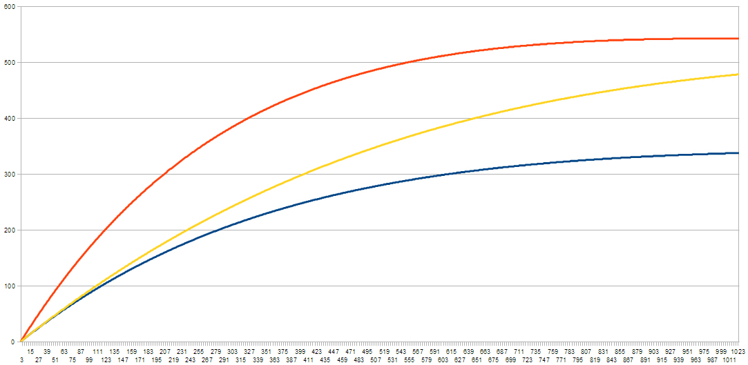
But with a bit of code, you can model the system's progression over time. And from that, you get follower curves like these; with a population of 1,000 and varying follow rates
The blue one at the bottom is for a follow rate of 1 in 10,000, and it has a very steady increase. The top, yellow one has a rate 40 times higher, and has a much quicker increase. The orange one is somewhere in between.


Limitations

But the yellow one reaches a peak, then slowly starts to drop. This is because the number of people who haven't already followed yellow is almost 0 - i.e almost everyone has followed them at least once.


And there in lies the problem. As it turns out, this system will eventually reach a point where S is empty, and the sizes of I and R become constant (a stationary point). This happens when I = (r/u)R, and how fast it happens depends on f.

In other words, for the above curves, since u and r aren't varied they will all stop when I = 250 and R = 750. The only difference is how quickly that happens.

But you could say it's sufficient over relatively short periods of time.


Improvements

First of all, the above model assumes the population (N) is constant - that is, that accounts aren't created or deleted. And obviously this isn't true, so it needs to be included to get a more accurate model.

So we introduce a birth rate, b - how many new accounts are created per unit time, assuming that any variation over time is relatively small. If the changing birth rate is significant and predictable, then it can be easy enough to account for. But for simplicity, we'll assume it's constant.

We also introduce a death rate, and for this we have two possible approaches:
- Either we assume that some proportion (1 in 10,000 or whatever) are deleted in a given time period.
- Or else, we assume a given, relatively fixed, number (say 100 a week) are deleted.

It's a question of whether death rate is constant, or proportion to number of users, and it's a quality of Twitter that you'd have to measure to find out. For simplicity, though, we'll say it's a proportional rate, value d.


The other thing to consider is the effect of the followers you already have - for example, new followers through friends of friends, or through increased exposure as a result of Follow Fridays, retweets, mentions, etc.

Now, as anyone who's used Twitter for a long enough period knows, #FFs don't actually have much effect, almost to the point of being insignificant. But it's still worth including, even if it's given very little 'infective power'.

And this is more like epidemiology, in that the more followers (infectives) you have, the more people there are to 'pass you on' to others. So we introduce a new term,

mI*ln(S) - where ln() is the natural logarithm function. This is important because for a large population, S, (as in the real world) if we didn't take ln(), this term would quickly over-power the rest of the model and follower numbers would grow very large very quickly.

m basically measures the ability of your followers to pass you along, which again is affected by how 'awesome' (or otherwise) you are. But at the same time, if your followers aren't the types of people who RT or FF or whatever, then your awesomeness becomes irrelevant.


Updated Model

So the new model looks something like this,
And as with the previous one, you can write a bit of code to simulate the system, you can play with variables and get an idea of how the system works, what happens when you do such and such, and so on.

Here are some example curves,
The blue one has f at 1 in 1,000 and m as 1 in 10,000, and what you can see is it grows steadily and stays fairly low - it's growth is limited and it essentially flattens out.

The orange one doubles f (keeping everything else the same). And you get the same sort of shape; it just grows faster and levels off higher.

The yellow is the same as blue, but with m doubled. And it falls somewhere in between the previous two - albeit less curved - but doesn't have the same levelling off (within the range of the graph).

Basically, the behavior of this model in most cases goes like this:

- Followers (I) will grow at a rate based, mostly, on the values of f and m.
- It will typically (eventually) reach a point where it's growth slows, almost to the point of not moving for long periods - it becomes pseudo-static - but ultimately it is still increasing.
- The point at which it reaches that pseudo-static state and how high it goes will depend on the variables (f,m,u,r), which is ultimately, relatively unique to each user.

Some other things to consider as well,

- In general, the birth rate is greater than the death rate. But by using a constant birth rate and proportional death rate, you find the population eventually stabilises and becomes constant at N = (b/d). But this is only a problem is the real-world death rate is proportional.
- As far as I know, this model doesn't have any stationary points. But then again, I didn't check. If they do exist, I imagine only the most popular celebrities will experience them. And that's only if the population becomes constant or starts to decline.


In the Real World

So this is still just an approximate model of follower growth. In the real world, you get a lot more 'noise' - one day you might get 3 new followers, but it could turn out they're all spam bots, and over the next week, they disappear one by one. This model essentially averages out that noise.

If you wanted to simulate this behaviour, you can add randomness into the (code) model. But as with the real world, it's ultimately just noise and not really necessary.

So the behaviour of the model may not be as rich as in the real world, but it's 'close enough'.

Other things that aren't accounted for are the fact that variables may change over time. Instead, we assume that their variation is insignificant and can be averaged out. The only time the change would really become significant and worth accounting for is if you suddenly became 'famous' (internet famous counts). But for most people this is not a concern, and more importantly it's not predictable.

The other thing you could add separately is the effect of following people (who don't already follow you). This is typically sporadic. But what you can ultimately do is say, for example, that you follow (on average) n people per week, and that there's an average 50% chance those people will follow you back. And once you've worked that out, you can just factor that value into f.


Usefulness?

If you want a vague idea of how your account's going to grow, this model should suffice. The variables you can get from measurements of your real-life follower growth so far. And from that you can get an idea of when you'll reach your pseudo-static point, and what that point will be (assuming you aren't already there).

But what's perhaps more interesting is if you measure people's personal variables. That way you can assign everyone values for 'attractiveness', 'retention rate', etc. And what you get is a new way to quantify a person's worth, or Twitter quality.


And as a final note, this model doesn't really apply to Facebook since FB doesn't have the follow mechanism, and because you're not getting connections from random people. It would, on the other hand, work for Tumblr, (with possibly some minor adjustments), as well as other sites with a similar follow mechanism.


Oatzy.


[Pro tip: people like to be able to put a number on how much better they are than their friends.]

Flowcharts created with free, online app Lucid Chart