Showing posts with label data analysis. Show all posts

Tuesday, October 14, 2014

Dark Matter and Machine Learning

If you're a long time follower of this blog you'll probably have noticed I haven't posted much in the last two/three years. This is because I've been busy with university stuff. This blog is sort of related to that. The following section is an edited version of the background I wrote for my final year project report (hence why it's so formal). Enjoy.


Background - Dark Matter and DM-ICE

According to current theories, dark matter makes up 23% of the mass-energy density of the universe. However, to date, it hasn't been conclusively observed directly. Instead, it's existence is inferred from large-scale gravitational effects, like the rotation curves of galaxies, and gravitational lensing. Based on rotation curves, we find that the outer edges of galaxies move as if there is more matter present than what we can directly observe. Consequently, it has been theorised that there is a halos of dark matter around the outer edges of galaxies, including our Milky Way.
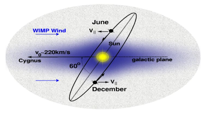

As our Solar System orbits around the galactic centre, it moves though this halo, experiencing an effective dark matter wind. This, combined with the tilt of the Earth's orbit around the sun, means we expect to see an annual modulation in the dark matter flux hitting the Earth. This modulation should have it's maximum around June when the Earth is moving into the wind, and it's minimum around December when it's moving away from the wind, regardless of location on Earth.

The current best candidate for dark matter are so-called Weakly Interacting Massive Particles (WIMPs). In direct detection experiments, we look at interactions between WIMPs and the nuclei in some target, such as Sodium Iodide (NaI) crystal. The WIMPs scatter elastically off nuclei in the target, and the recoil of the nuclei cause scintillation photons to be emitted, with summed energies of ~10keV range. Direct detection is hard, however, since WIMP interactions are rare events, where we expect << 1 count/day/kg. So identifying WIMP events, especially at low energies, requires significant background and noise suppression.

Various direct detection experiments (DAMA, CoGeNT, CRESST, CDMS, etc.) have already been run, but none yet have conclusively detected dark matter. Of particular interest from these experiments are the results from the DAMA/NaI and DAMA/LIBRA experiments. The DAMA experiments (Gran Sasso, Italy) ran direct detection using NaI(Tl) (Thallium doped Sodium Iodide) crystals, and observed an annual modulation in the 2-6keV energy region, which they claim is the result of the dark matter wind. However this interpretation is disputed. It is argued that the modulation could have come from some other unaccounted for signal – for example muon flux also has an annual modulation with peak around June (in the Northern Hemisphere).
Source - ArXiv:0804.2741
DM-ICE is a joint venture between University of Sheffield (UK), and University of Wisconsin (Madison, USA). The aim, along with other independent direct detection experiments being run around the globe, is to test the DAMA result by looking for this same modulation, and by ruling out other possible sources of modulation. By running at the South Pole, DM-ICE is in the opposite hemisphere to DAMA, so seasonal effects – such as temperature and muon flux – are reversed, while the dark matter modulation should stays the same.


Context

For my final year project I was looking in particular at the performance stability of the detectors (loss of light yield, etc.) and how to correct the data for those effects. I also did some preliminary modulation analysis - looking for evidence of dark matter in the data.

This blog post isn't really to do with any of the work I did on my project, though. Rather, this is looking at how to remove noise from the data. For my project, this work had already been done, so I didn't have to worry about it. So why am I looking at noise removal now?

When the academic year was over, my project supervisor asked if I wanted to carry on working on the project (funded) for the summer. It made sense, since there was still work to do, and since I already knew the project well. So mostly I was doing more of what I did for the project. But the supervisor also wanted to adapt the DM-ICE project into a simplified version for groups of 3rd year students to do.

Specifically, the students would have to figure out the best cuts to remove noise, then do a modulation analysis to decide if there was evidence of dark matter.

So I set up a simplified version of the data and wrote up a description of the project for the students. The supervisor then asked if I'd work through the project and write up a model answer so that he'd have something to mark against. Hence, it was my turn to try the noise removal stuff.


Pulse Classification

In a DM-ICE detector, we have an 8.5kg NaI(Tl) crystal between paired photo-multipliers (PMTs). These two PMTs - DM0 and DM1 - record scintillation events as voltage pulses (in ADC units). When the raw data is processed, we look for pulses from both of the PMTs which occur within 100 ns of each other. These pairs of pulses are assumed to have come from the same scintillation event.

At low energies, pulses look something like this


where the various spikes represent single photo-electron events (SPE). Unfortunately, at low energies there is also a significant amount of noise events - specifically, electromagnetic interference (EMI) that look something like this


and 'thin peaks', that look something like this


So the task is to identify and remove these EMI and thin peak events.

From looking at plots of the pulses, it's fairly straightforward to tell the different event types apart. But computers can 'look' at the pulses. Instead, we have to define some parameter - values that we can calculate that will tell the computer something about the shapes of the pulses.

Take, for example, the EMI pulses. From the plot we can see that EMI pulses oscillate rapidly between positive and negative ADC values, where the SPE and thin peak events don't. So we can define some parameter, which we'll call 'emi', which basically counts how many times the pulse goes from positive to negative (or negative to positive) in the first 40 bins of the pulse.

So since the emi value is going to be much higher for EMI-type pulses than for SPE or thin peaks, identifying and removing EMI events is relatively easy.

Separating the SPEs from the thin peaks is less straightforward. For this, we calculate various other parameters - for example, since thin peaks will typically only have one peak, while an SPE event will have several, we can look at the peak number. Other things we can look at are how quickly the pulse decays to zero (log-meantime), or how the pulse energy is distributed. The details of how these parameters are calculated aren't important to this blog.


Human Learning

What you can do, then, is look at a bunch of pulses - plot it, what type of event is it? What are it's parameter values? You collect together the results and you ask, what sort of emi values do EMI-type events have? What sort of peak numbers do SPEs and thin peaks have. How can you use that information to tell the peaks apart?

And that's fine. But it's also boring. You have to plot, and calculate, and record. Repeat. Analyse. Boring.

I subscribe to the philosophy of "why do yourself what you can make a computer do?". In practice this usually means making the work more 'complicated' in the short term, but once it's done it makes life a whole lot easier. And while the work is more complicated, it's at least more interesting as well.

So what I did was I wrote a program. It looks something like this
(I used Python with Numpy, Matplotlib for plotting, and PyQt4 for the GUI.)

Basically it plots the pulses and presents you with three buttons - signal (SPE), noise (thin peak), and EMI. On the front-end, all the user has to do is look at the plot and decide what type of event the pulse is. Meanwhile, on the back-end, the program calculates the parameters, and sorts them according to the user's classifications.

Once you've classified a set of pulses, you're presented with histograms of the different parameters, like this (for the emi value parameter)


where the different event types are plotted in different colours. This makes life a lot easier. For example, in the above, it's immediately apparent that EMI-type events can be removed from the data by cutting any event with an emi value above 25.


Machine Learning - Naive Bayes Classifiers

Lets make this more interesting. Sure, we can click through a bunch of peaks telling the program what's what. But wouldn't it be cooler if we could teach the program to tell the events apart itself?

Yes. Yes it would.

This is where machine learning comes in. Now there are various machine learning techniques, but the one I used in the program is called a 'Naive Bayes Classifier'. This is the sort of thing that's used in spam filters - it's a way of calculating, for example, what is the probability that a particular email is spam given that it mentions, say, penis enlargement or Nigerian princes.


Quick Introduction - Bayes' Theorem

Imagine there is a person. Sight unseen, what is the probability they are female? Well, given that there are roughly equal numbers of males and females in the world, the probability is about 50%. This is called the prior probability.

[Aside: in this example, we're assuming for simplicity that gender is a binary state.]

Now, we're given a new piece of information - this mystery person's height is 5'4 (five feet and four inches). Now the question is, what is the probability the mystery person is female, given they are 5'4? Well, females tend to be shorter than males (on average) so we might say that the mystery person is more likely to be female that male. But how do we quantify this new probability?

This is where Bayes' Theorem comes in. It looks like this

Basically, this calculates the probability of a hypothesis (H) given some observation/evidence (O). p(H|O) is called the posterior probability.

For our example, we have the hypothesis "female" (F) and the observation "h=5'4". So the terms for this example are:
  • p(F)  -  The probability of a person being female. This is our prior.  [ 50% ]
  • p(h=5'4|F)  -  The probability of a person being 5'4 given they are female. Or to put it more plainly, the probability of a female being 5'4.   [ ~15.1% ]*
  • p(h=5'4)  -  The probability of any person being 5'4. This can be calculated as the (weighted) average of the probabilities of a female being 5'4, and a male being 5'4. In other words, the probability can be expanded as

    p(h=5'4)  =  p(h=5'4|F) p(F) + p(h=5'4|M) p(M)

    where p(h=5'4|M) is the probability of a male being 5'4   [ ~1.8% ]*

Putting it all together, we calculate the (posterior) probability of the mystery person being female given their height is 5'4, as


As we expected, this probability is much greater than 50% - the mystery person is more likely to be female than male, given their height.

*Aside: These figures come from average heights for Americans aged 20-80 for 2007-2008.

Obviously the probabilities would vary depending on where the mystery person is from, how old they are, etc. Since all we know about this mystery person is their height, we shouldn't really make assumptions about their background. But for the sake of demonstration (and convenience), these values are sufficient.


Gaussian Naive Bayes - When the Training Set is Small

So how does this apply to noise removal?

Let's go back to EMI - we can ask, what is the probability that an event is EMI-type given it has an emi value of 30?

Using Bayes' Theorem, we have


Now we need to calculate the probabilities. We're going to assume we have a training set of (31) events that have already been classified. From this we can calculate/estimate these probabilities.

The prior, p(E), is pretty straightforward - what fraction of the events in the training set are EMI? This turns out to be around 22.6%

The probability of an EMI-type event having an emi value of 30 - p(emi=30|E) - is a little trickier to find. If our training set is small we may have no events with an emi value of exactly 30. But there could, at the same time, be several events with emi values slightly above or below 30.

Here then we have to make an assumption - we're going to assume that the distribution of emi values (for each event type) can be approximated by a normal distribution. This approach is called the 'Gaussian Naive Bayes', and is usually a reasonable approximation - if you look at the plot of emi values higher up, you'll see that they are roughly normally distributed.

So to find p(emi|E) we need to calculate the mean and standard deviation of the emi values for the EMI-type events in our training set. Obviously, when the training set is relatively small, the mean and standard deviation are going to have a large margin of error. So it's important to make sure we have a sufficiently large training set.

For p(emi=30|!E) - that is, the probability that an event that isn't EMI-type (signal or thin peak) has an emi value of 30 - we do the same procedure of calculating the mean and standard deviation of emi values for non-EMI events, again assuming a normal distribution.

For my training set of 31 events, the probability works out at p(E|emi=30)  =  97.96%

In other words, an event with an emi value of 30 is almost certainly an EMI-type event.


Machine Peak Classification

For the full Naive Bayes Classifier, you just repeat the process above for all the parameters, then combine the probabilities. For example, the probability that an event is noise given its log-meantime value and peak number, would be given by


It's 'naive' because it assumes all the parameters are independent of each other. This isn't strictly true, but it's an acceptable approximation.

In fact, in practice, rather than calculating the probability, we calculate the 'log-likelihood ratio'

where Pi are the various parameters. From that it's pretty straightforward to extract the probability that an event is noise given its parameters. Alternatively, we can just say that if the log-likelihood is greater than 0 - if the probability of being noise is greater than the probability of being signal - then the pulse is classified as noise.

The point here is that, rather than investigating the differences between the different pulse types ourselves, then hard coding how to tell pulse types apart - e.g. explicitly writing in the code that an event is EMI-type if it has an emi value greater than 25, etc. - we instead show the code some examples of different pulses, and it 'learns' to tell the difference itself. This saves us a lot of work. In fact, we never even have to know what the differences between pulse parameters are.

When you're using the program, you can have it display what the algorithm thinks pulses are (and the associated probabilities). So you can click through a bunch of pulses, telling the algorithm what they are, and the algorithm will tell you what it thinks they are. As you 'teach' it, the algorithm will get better at telling the difference between pulses. And when you're happy with how well its classifications match up with your own, you can press a button and it will classify the rest of the pulses for you. How cool is that?


Finding the Best Cuts

Once the algorithms is adequately trained, we could just set it to work, going through the data, classifying and removing noise events. But for their project, the students aren't looking at machine learning, or statistics, or anything like that. Instead, they're asked to look for cutoff conditions for each of the parameters - for example, a pulse is noise if it has emi > 25.

To get a better idea of the problem we can look at our histograms of the parameters, with the different pulse type plotted in different colours. This is where the pulse classification comes in useful - the more pulses we classify, the clearer the distributions of parameters.

When you're looking at the emi values, as in the plot higher up, the cutoff is pretty easy - there's a clear gap between emi values for EMI-type pulses, and those for signal and thin peaks. For other parameters, the distinction is less clear, and often we have to make some trade off between leaving behind noise events and removing signal events. For example


Here, if you want to keep all the signal, you leave behind 23 (thin peak) noise events (34%). If you want to remove all the noise you end up also removing 6 signal events (54%).

Aside: Since EMI-type events are easily distinguished and removed with the emi value cut, they are not taken into account when we look at cuts for the other parameters, which are meant to separate signal from thin peaks.

So the question is, how can we determine the 'best' cuts?

This is basically an optimisation problem - we want to find the cut for which the maximum amount of noise AND the minimum amount of signal is removed. To do this, we need to come up with some metric/way of scoring how effective a given cut is, then we look for the cut that scores best.

We'll define Ni as the number of noise events and Si the number of signal events removed by some cut Ci. Because there are generally more noise events than signal, we're going to score based on the fractions of noise and signal removed - (Ni/N) and (Si/S) - where N and S are the total number of noise and signal events respectively. So the optimisation problem is finding the cut that gives (Ni/N) closest to one and (Si/S) closest to zero, simultaneously.

One approach to this optimisation is a 'nearest neighbour search'. To make this clearer, we can look at a scatter plot with points representing the fractions of signal and noise removed for different cuts. In this set-up, optimising means looking for the point that is nearest the bottom-right corner of the graph (1,0).


We can find the distance of each point from (1,0) using Pythagoras, making the scoring function
which we want to minimise.

There is one caveat though - a cut that, for example, removes 10% of the signal and 60% of the noise will have the same distance score (0.41) as a cut that removes 40% of the signal and 90% of the noise. The latter removes more noise (almost all of it) but also removes more signal. In this case we have a choice - do we want to remove more noise, or save more signal?

To differentiate the two cases we can use the angle between the point and the noise-axis
So if, for example, we want to save as much signal as possible then we want to minimise the angle. Or perhaps for a better balance between removing signal and noise, we should prefer the cut that gives an angle closest to 45deg. For myself, I prefer to save as much signal as possible. In practice, however, having two or more cuts with the same distance score is rare.

When it comes to reporting the (distance) scores, they are re-formatted as
This gives a score of 1 for a cut that removes all noise and no signal, a score of -1 for a cut that removes all signal and no noise, a score of 0 for a cut that removes no signal or noise at all, etc. This score could be used in the optimisation algorithm (where it would need to be maximised), but the results would be the same, and the Pythagorean distance is easier to calculate.

Below is an example cut from this algorithm.
Notice that it sacrifices one signal event for 15 noise events, but prefers to keep one more signal event, rather than removing an extra 5 noise events.

Ultimately, this technique of removing noise with parameter cutoffs is less effective than the Naive Bayes, largely because it considers all the parameters individually/independently. However, there are things called 'support vector machines' (SVM) which would probably be ideal for this problem. They look for a dividing 'line' between signal and noise, as above, but they consider all of the parameters together. OpenCV has an implementation of SVM, so I might give that a try at some point.


Last Word

As it started out, I just wanted to throw together a quick GUI to make my life easier, without worrying about error handling or bugs or any of that other fiddly stuff. Then I decided I wanted to try out some machine learning. And the more I worked on the program, the more features I thought of, and added.

So now, I have a program designed specifically for removing noise from DM-ICE data. But since DM-ICE has already had its noise removed (as far as possible), the program is basically of no use to anyone. Well, except maybe to any students working on this project. But that would be cheating - hence why I'm wary of posting the code.

Still, it was a fun little project.


Oatzy.


[Keep an eye out for news on DM-ICE.]

Saturday, March 24, 2012

Some Twitter Infographics

I did some stuff like this before. And I figured, while I was updating my network graphs, why not update some of the other graphics?

And it helps that I worked out how to easily extract data from Twitter (see previous blog). The code is here. Again, rate limits apply.


Who Do I Follow?

This is one of the ones I did before - collect together the bios of the people I follow, then make a word cloud (using Wordle)
Basically, I follow a bunch of geeks and writers. Who like 'things'. So really, same as a year and a half ago.

I would point out though that 6 of the people I follow don't have bios, and about 7 just have lyrics.

Data here.


Who Tweets the Most?

These rates are worked out as (total tweets posted)/(total days online). Obviously, the actually post rate will vary over different time scales..
Bubble chart (made with ManyEyes) - bubbles sized by tweet rate (the numbers on some of the bubbles).

The graph below gives a better idea of relative rates, and 'rankings' (click to embiggen)
The blue line is actual values.

The orange is a logarithmic trend-line. It's a pretty good fit (R2=0.95); and, loosely speaking, it means ~70% of the tweets in my timeline come from ~30% of the people I follow. [cf: Pareto Principle]

You get similar log-shaped graphs when you split up the genders.

Full data here.


Chattiest Gender?

You can read all the explanation, caveats, etc. in the previous posts (here and here). I'm just going to go straight into the data.

I follow 27 men and 21 women (excluding celebrities, etc.). The stats are as follow:
Men:
Average = 6.21 tweets/day
Standard Deviation = 6.47

Women:
Average = 13.79 tweets/day
Standard Deviation = 14.27
For clarity, here's a  boxplot (made in R)
Basically, the women tweet more on average, and their rates are more spread out than for the men. In fact, roughly three quarters of the men tweet less than half of the women. Also, there's one outlier in the female group.

This is similar to what we found last time; although the women's average and spread aren't quite as high (average: 13.79 vs 19.21), and the men's average has increased slightly (6.21 vs 5.29).

If you take the ratio of the averages, the women tweet 2.15 times as much as the men. But maybe I just follow particularly chatty women..

Here's treemap (ManyEyes), which should give you a better idea of the gender balance (boxes sized by tweet rate)
Specifically, the graphic above is 62.5% purple (female).

Data here.


Where in the World Are My Followers?

The site I used last time doesn't seem to exist anymore. So I'm using MapMyFollowers instead. As the name suggests, these are my followers, rather than just the people I follow. Nonetheless..
Mostly in the UK and the US. As you'd probably expect.

I will point out though, some of the locations are a little suspect. Some people haven't made their location available so aren't included, and others seem to be in countries they couldn't possibly be in. But it's the best we can do.

Here's a zoom in on the UK


What Do I Tweet?

Made with Wordle, with data from TweetStats.

Words are sized by how often I tweet them; and by extension, @usernames are sized by how often I tweet those people.

In fact, here are the people I 'mention' the most (TweetStats)
Couldn't get a good source on who @replies me. That was one of the things Twoolr used to do..


When Do I Tweet?

Twoolr used to be awesome for Twitter statistics. But sadly, when they left beta, they started charging. And their free service went to shit. Luckily, I found TweetStats. Weirdly, it doesn't need you to log-in or anything, but somehow it can pull data on (nearly) all your tweets - beyond the 3,200 limit. Strange.

Here's some more graphs
Basically, I tweet most on a Friday and Saturday, and at around 1-2pm.

And I've never tweeted at 5am. But that's probably because I'm always asleep at 5am
Except that one time I got really drunk. (SleepBot)


How Much Do I Tweet?

This is another one I used to go to Twoolr for. And, to be fair, I still could. But that only goes as far back as April '10, and its graphics aren't as clear. Here's TweetStats again
Like I said before, I didn't tweet much in my first year. In fact, I only posted 36 tweets in all of 2009.

Now, the one problem with TweetStats is that 5 month gap in 2010. Why is this significant? Well, I was definitely tweeting during that time. In fact, by my estimates, over those 5 months I posted 5,724 tweets (~37tweets/day). So those 5 months account for 43% of all my tweets.

See, the thing is, in 2010, I was out of university, single, and unemployed. I posted a total 8,823 tweets - 24tweets/day. Since I've been back at university, that number's dropped to 11tweets/day.

That lull in Summer 2011 was when I was spending all my time on Tumblr and watching classic Doctor Who. Incidentally, I haven't posted on Tumblr since the start of September '11. It's terribly addictive, you see. I wouldn't recommend it; unless you're addicted to Doctor Who and Sherlock, and have lots of time on your hands..


So yeah.


Oatzy.


[Self-indulgent statistics, and pretty illustrations.]

Wednesday, March 14, 2012

Friend Network Evolution

Back in February 2009, I created my Twitter account, upon the insistence of my then-girlfriend. I didn't get it. Back then, Facebook was where it was at, I didn't really get Twitter's appeal. I was pretty much just following the handful of people I knew in real life, and Stephen Fry.

So I didn't use it much. I'd pop up every now and then, post a couple tweets and give up on it again. At one point, I even developed an irrational dislike of it - whenever I saw a site had a "follow us on Twitter" button, it irked me for some reason.

But at some point, towards the end of 2009/early 2010, I gave it yet another try. I don't know why. And even when I started using it, I was resistant; still half-heartedly hating it. But what was different this time, is I started chatting with people, and I was introduced to new people.

People who don't get Twitter think it's just that thing where you can tell people when you're eating a sandwich. It's not. It's the people that make Twitter. (Tweens and arseholes notwithstanding.)

But I'm going off on a tangent.


By August 2010, I was well into Twitter - I was posting around 30 tweets per day, and I had around 30 friends*. And back then, I decided I wanted to see what my friends network looked like. So I broke out Python and the Twitter API, I pulled data, and I made the graph. Here's an updated version of it.
[click to embiggen]

Fairly small, and tidy, and relatively uncomplicated. The bulk on the right is the people I knew in real life (from school, etc.) with a few strands of new acquaintances. Note how tightly packed and interconnected they are. To the left is mostly people I met through Twitter - and in particular, through PkmnTrainerJ.

(In case you hadn't figured it out, the node and label sizes are proportional to number of connections.)

By December 2010, I decided to have a look again.
Again, this is an update of the version I originally posted; and in this case, I've tried to arrange it so that key people stay in approximately the same place.

So you still vaguely have that left-right divide, but now there's much more mixing in the middle. I'd made some new friends, but more interesting is the people who were already in the graph who formed new connections with others in my graph.

I'd also like to draw your attention to shinelikestars_ (formerly shinelikestars6) - take a look at the previous graph, can you spot him? From 2 shared connections to 8 in the space of two months. I don't think there's any sort of point I'm trying to make here. I'm just pointing it out 'cause it's interesting.


And for the next year and a half I didn't do any data collecting. It became too labourious - Twitter changed its API, so that my old code didn't work, and I had to do everything by hand.

So, the latest graph was March 2011 (technical details below). As you can imagine, a lot can happen in a year and a half.
First of all, the new people add, and the old people removed. But more importantly, look how much tighter, and how much more 'segmented' the graph is.

There are now three major groups, loosely centred on the three most connected of my friends.
On the far right are, again, the people I knew in real life. In particular, note how little that group has changed since the first graph.

In the middle, we have 'Shiney's People' - people I was introduced to by shinelikestars_. And on the left are the people I was introduced to by PkmnTrainerJ.

The smaller groups circled in red are cliques - smaller subgroups that, at least from my point of view, form their own little groupings, where (almost) everyone is interconnected. The bottom left 'clique', for example, is my parents and big sister.

And I suspect, if you were to extend the graph beyond my network, you would find that those cliques are just parts of larger interconnected groups.

In case you were wondering, PkmnTrainerJ and SallyBembridge are most connected, both with degree 14. shinelikestars_ is next most, with degree 10.

Notable disappearing nodes - Benjidoom, who deleted his account, then created a new, private one (benjirino); and AimlessAmy, who is a long story.

I should also point out that the people I follow who aren't friends with anyone else in my network do not appear in the pictured graphs. Not that they aren't as cool, they just don't join onto the graph.

* I use friend here to mean people who I follow and who follow me back. Though I would probably consider all the people in my current network (including those not pictured) friends to some degree.


Technical stuff

You can read details on how I collected the data before, in the previous blogs. But, as I say, those methods don't work anymore.

For this run, I read up on the API, and found some bits that don't need authentication to grab and manipulate.

First, you can grab a list of a user's friends with this URL

https://api.twitter.com/1/friends/ids.xml?screen_name=<username>

This will give you a list of the friends ID numbers, so you also need to use this to grab usernames

https://api.twitter.com/1/users/lookup.xml?user_id=<idnumber>

There is also a URL to check if a user follows another user

https://api.twitter.com/1/friendships/exists.xml?user_id_a=<idnumber1>&user_id_b=<idnumber2>

Which works through the browser, but I couldn't get to work in my code. So in place, I used the site DoesFollow.com; partly because it uses the URL scheme  

DoesFollow.com/user1/user2.

Which is very convenient. Though I do worry all the requests might be putting strain on that site's server.

So, putting all that together with a bit of Python, you get something like this.


A few important points:

1) It will take a while to run. I have ~50 friends, and it took well over an hour to pull all the data. In terms of computational complexity, it's O(n^2), but each of those operations takes a significant amount of time.

2) Twitter has an API limit of 150 requests per hour. The number of API requests the code will make is ~ the number of friends being looked up. I think. Which means, if you have more than 100 or so friends, this code probably won't work. Sorry. There might be a way around it, but I don't know how.

3) Obviously, this doesn't work on protected accounts. So for those people you will have to grab data by hand. Though it's not too bad for a small enough number of people.

If you do want to use the code, I've made it so you just have to change the username at the top, and run it. You will need to install Python though.

For creating the graphs, I previously use ManyEyes. But I moved to using Gephi, because it allows for more customising. The output from the code is a text file with a list of name pairs, which you can import directly into Gephi. It will build the graph for you, and then you're free to play as you like.


Aaand... Yeah, I think that's about it.


Oatzy.


[shinelikestars6 lost his red circle, on account of he isn't my nemesis anymore.]

Monday, March 05, 2012

So What Was the Best Day To Go Shopping?

Alright, let's be done with this.

Just a quick reminder - what I did was collect Foursquare check-in data for various shopping centres around the UK, in the hope that the data might show something interesting.

Previous blog posts on this data collecting - Best Day to Go Shopping, Panic Saturday, Christmas Eve.

Anyway, I've been collecting data for over 3 months now. And that seems like quite enough.

Here's a graph of (normalised) averaged check-ins on each day of the week for 4 periods:
DecAv (blue) is 21st Nov 2011 to 18th Dec 2011
ChrAv (grey) is 19th Dec 2011 to 1st Jan 2012
JanAv (orange) is 5th Jan 2012 to 2nd Feb 2012
FebAv (green) is 6th Feb 2012 to 4th Mar 2012

Aside from the two weeks either side of Christmas (grey) - when people, apparently, did their shopping more midweek - the pattern is basically the same.

For further clarity, here's the average of those three averages (excluding Christmas)
And here is the order of days, from least to most busy ('relative busyness' in brackets):

1) Wednesday (1.00)
2) Monday (1.01)
3) Tuesday (1.03)
4) Thursday (1.11)
5) Sunday (1.15)
6) Friday (1.24)
7) Saturday (1.78)

Note that the differences between Monday, Tuesday, and Wednesday are not statistically significant - they're essentially the same, and are likely to be as busy as each other/not noticeably different.

So, to answer the title question - Monday, Tuesday, and Wednesday are the best days to go shopping. At least, in as much as they're the days shopping centres are likely to be least busy. And, as you'd expect, Saturday is, by far, the worst/most busy.

And the last thing to point out is that these are the averages over 20 shopping centres for a ~3 month period - numbers for specific locations, and at different times (eg holidays) are likely to deviate from the averages.

And, basically, that's that.

If you're interested, you can see the raw check-in data here.


Oatzy.


[That was definitely worth the effort.]

Saturday, December 24, 2011

Christmas Eve

The run up to Christmas is over, and hopefully everyone has their Christmas shopping done. So now seems like as good a time as any to look at what the crowds are doing:
Now that is interesting. I think it is, anyway.

So first of all, the weekday spikes. It seems like a significant number of people left their Christmas shopping to the last week. Now fair enough if they've only just finished work/university/whatever.

Notice also the general week-on-week trend for the weekdays.

But more importantly than all that, look at today - Christmas Eve.


Anti-Crowds

Everyone 'knows' that going shopping on Christmas Eve is suicidal. It's a well known cliché. But that's the thing - everyone thinks it's going to be insanely busy, so a lot of people avoid shopping centres.

But then, this means the shopping centres end up practically deserted (by Christmas standards). And it's not necessarily the result of what I mentioned last time - I was out there, and I saw the lack of crowds.

It's an interesting, and previously studied phenomenon.

I won't go into too much detail, cause it's past midnight on Christmas Eve. But if you're interested in this effect, and in this sort of thing in general, I would suggest reading up on Complexity Theory. In particular, I'd recommend this book, which covers this exact subject in one of the early chapters.


Of course, if we were looking at supermarkets, that would be a different story..


Oatzy.


[Merry Christmas!]

Friday, December 09, 2011

Best Day to Go Shopping

The Question

As the title suggests - which is the best (least busy) day to go shopping on?

Or more generally, how do crowds at shopping centres vary over time? Which days are busiest, or least busy? Are the shops getting busier as we get closer to Christmas? Less busy?!

It an interesting question, and one that's probably been looked into before. But still, I had an idea and I'm running with it.

[Feel free to skip straight to the results if you're not interested in statistics and the likes..]


Data Collecting

Data collection on this is tricky. Especially if you don't have legions of people to go out and actually count people. What I want to do is extract numbers with the minimum of effort.

So here's the game - Foursquare.

If you're unfamiliar, Foursquare is a 'social game', for which you 'check-in' to locations and earn points and badges accordingly. It's also good if you're an obsessive types who likes to keep track of where they've been.

So the idea is this - some subset of shoppers will be Foursquare users, who will check-in when they visit any given shopping centre. If we can extract check-in counts over a given time period, hopefully that can be used as an indicator of a place's 'busyness'. Obviously, this is flawed - but more on that below.

Right. So on the Foursquare page for a given venue, there isn't a total historical record of check-ins over time. Instead, what we have is the total number of check-ins at that location up to the time when you loaded the webpage.

What we do, then, is record that number at some fixed time every day (say, midnight). Then the number of check-ins on a given day is the difference between the total at the end of the day and the total for the end of the previous day. Easy.

In fact, to make life a little easier, I wrote this bit of code [python]. All I have to do is remember to run that every evening, and we have our data.


Sampling

There are two possible sources of sampling errors:

1) Location

If we only track one location, we have a very small sample size. That means we're subject to perturbations - for example, a major event like the Christmas lights being switched on - or just general statistical noise. Also, shopping patterns may vary across the country, or depending on how close to a city centre the centre is located, and so on.

It's actually fairly easy to overcome this. First of all, we have this list of the largest shopping centres in the UK. From that list I picked 20 locations to sample. This data can then be normalised and averaged to look for any general patterns that are (relatively) store independent.

Oh, and I should probably mention, since this data is being collected from places in the UK only, patterns may vary for different countries.


2) Users

Using Foursquare data, we're working on the assumption that as the number of shoppers increases (or decreases), the number of Foursquare check-ins will increase in proportion.

This is not necessarily the case.

First of all, we look up the Foursquare user demographics. There is no one source of definitive data on this (that I could find). But to get a general idea, there is this, based on a survey of BART travelers.

Obviously, this demographic source is for users of an American transport service, but I'm assuming it's representative of Foursquare users in general.

From this we see that the typical user is most likely male, age 25-34. Or to put it another way, women, young people, and old people are under-represented. And from my experience, it seems like women and old people are the most common shoppers on weekdays.

So this may introduce a disparity between the data and reality. But it's not one we can really do anything about (without seeking an alternative source of data). So, as long as there is a general size proportionality between shoppers and check-ins, we'll consider the data acceptable.


Results

By far, Saturday is the worst day to go shopping (in terms of crowds). But you already knew that.

So I have my data for the last 3 weeks, for 20 shopping centres across Britain. Here's the raw data, for if you're into that sort of thing.

I worked out the check-ins for each place on each day, then normalised by shopping centre - so that the total number of check-ins for each shopping centre over the three week period now adds up to 100. I then averaged these 'norms' across all shopping centres.

Here's what those results look like.
In fact, I went back and 'tidied up' the data, removing venues with less than 100 check-ins total during the recording period - since their sample sizes were maybe too small for any patterns to be statistically significant - and removed a couple of anomalies (one place ended up with negative check-ins).

This is what the tidy plot looks like
[Updated since original post]

Pretty similar, but some of the bars are now closer together (removes the anomalies from Sunday and Wednesday).

So from the results above, the order of days, from least to most busy, seems to be:

1) Monday
2) Thursday
3) Tuesday
4) Wednesday
5) Sunday
6) Friday
7) Saturday

But note, it's pretty close amongst the top 3 least busy days.

It shouldn't be too surprising that weekdays are less busy than weekends - what with people working.

As for Sunday being so low compared to Friday and Saturday - well, that might be the result of Sunday opening hours.

For example, Meadowhall has typical opening hours of 9am-8pm, but on Sundays it's 11am-5pm -> 11hrs vs 6hrs. So maybe it would make sense to re-adjust accordingly. But deciding how, exactly, to re-adjust is tricky. So we'll just leave it be.

NB/ Wednesday, week 2 maybe distorted due to public sector strikes - there certainly appeared to be more people on the train. But but a lot of that increase was from children (see sample bias above).


Of course, each shopping centre is unique, and there will be variation as to which days are best and worse for each. As an example, here's what the (non-normilised) plot looks like for Westfield London (the most checked-in to shopping centre by far)
Again, pretty similar to the average. But in this case, Wednesday is less busy than the average, and Thursday more. And Friday has that weird dip in week 2, bringing its average down.


One last thing I'd like to point out - notice there is no particular week-on-week trend. That is, the number of check-ins isn't (on average) increasing as we get closer to Christmas. Or decreasing for that matter. Which is, perhaps, not what you'd expect.

But maybe that will change within the next couple of weeks. And certainly after Christmas, when the January sales kick off. Maybe.


This is an on-going project - bear in mind, this is only 3 weeks worth of data, so it may be too soon to draw any solid conclusions - but I will keep you posted. Maybe I'll do another post just after Christmas, or after New Year's. At any rate, I'll tweet it when I do.


Oatzy.


[There's always online shopping..]