Background - Dark Matter and DM-ICE
According to current theories, dark matter makes up 23% of the mass-energy density of the universe. However, to date, it hasn't been conclusively observed directly. Instead, it's existence is inferred from large-scale gravitational effects, like the rotation curves of galaxies, and gravitational lensing. Based on rotation curves, we find that the outer edges of galaxies move as if there is more matter present than what we can directly observe. Consequently, it has been theorised that there is a halos of dark matter around the outer edges of galaxies, including our Milky Way.
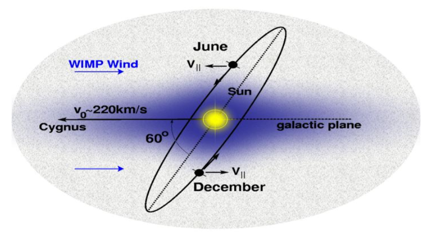
As our Solar System orbits around the galactic centre, it moves though this halo, experiencing an effective dark matter wind. This, combined with the tilt of the Earth's orbit around the sun, means we expect to see an annual modulation in the dark matter flux hitting the Earth. This modulation should have it's maximum around June when the Earth is moving into the wind, and it's minimum around December when it's moving away from the wind, regardless of location on Earth.
The current best candidate for dark matter are so-called Weakly Interacting Massive Particles (WIMPs). In direct detection experiments, we look at interactions between WIMPs and the nuclei in some target, such as Sodium Iodide (NaI) crystal. The WIMPs scatter elastically off nuclei in the target, and the recoil of the nuclei cause scintillation photons to be emitted, with summed energies of ~10keV range. Direct detection is hard, however, since WIMP interactions are rare events, where we expect << 1 count/day/kg. So identifying WIMP events, especially at low energies, requires significant background and noise suppression.
Various direct detection experiments (DAMA, CoGeNT, CRESST, CDMS, etc.) have already been run, but none yet have conclusively detected dark matter. Of particular interest from these experiments are the results from the DAMA/NaI and DAMA/LIBRA experiments. The DAMA experiments (Gran Sasso, Italy) ran direct detection using NaI(Tl) (Thallium doped Sodium Iodide) crystals, and observed an annual modulation in the 2-6keV energy region, which they claim is the result of the dark matter wind. However this interpretation is disputed. It is argued that the modulation could have come from some other unaccounted for signal – for example muon flux also has an annual modulation with peak around June (in the Northern Hemisphere).
 |
| Source - ArXiv:0804.2741 |
Context
For my final year project I was looking in particular at the performance stability of the detectors (loss of light yield, etc.) and how to correct the data for those effects. I also did some preliminary modulation analysis - looking for evidence of dark matter in the data.
This blog post isn't really to do with any of the work I did on my project, though. Rather, this is looking at how to remove noise from the data. For my project, this work had already been done, so I didn't have to worry about it. So why am I looking at noise removal now?
When the academic year was over, my project supervisor asked if I wanted to carry on working on the project (funded) for the summer. It made sense, since there was still work to do, and since I already knew the project well. So mostly I was doing more of what I did for the project. But the supervisor also wanted to adapt the DM-ICE project into a simplified version for groups of 3rd year students to do.
Specifically, the students would have to figure out the best cuts to remove noise, then do a modulation analysis to decide if there was evidence of dark matter.
So I set up a simplified version of the data and wrote up a description of the project for the students. The supervisor then asked if I'd work through the project and write up a model answer so that he'd have something to mark against. Hence, it was my turn to try the noise removal stuff.
Pulse Classification
In a DM-ICE detector, we have an 8.5kg NaI(Tl) crystal between paired photo-multipliers (PMTs). These two PMTs - DM0 and DM1 - record scintillation events as voltage pulses (in ADC units). When the raw data is processed, we look for pulses from both of the PMTs which occur within 100 ns of each other. These pairs of pulses are assumed to have come from the same scintillation event.
At low energies, pulses look something like this

where the various spikes represent single photo-electron events (SPE). Unfortunately, at low energies there is also a significant amount of noise events - specifically, electromagnetic interference (EMI) that look something like this

and 'thin peaks', that look something like this

So the task is to identify and remove these EMI and thin peak events.
From looking at plots of the pulses, it's fairly straightforward to tell the different event types apart. But computers can 'look' at the pulses. Instead, we have to define some parameter - values that we can calculate that will tell the computer something about the shapes of the pulses.
Take, for example, the EMI pulses. From the plot we can see that EMI pulses oscillate rapidly between positive and negative ADC values, where the SPE and thin peak events don't. So we can define some parameter, which we'll call 'emi', which basically counts how many times the pulse goes from positive to negative (or negative to positive) in the first 40 bins of the pulse.
So since the emi value is going to be much higher for EMI-type pulses than for SPE or thin peaks, identifying and removing EMI events is relatively easy.
Separating the SPEs from the thin peaks is less straightforward. For this, we calculate various other parameters - for example, since thin peaks will typically only have one peak, while an SPE event will have several, we can look at the peak number. Other things we can look at are how quickly the pulse decays to zero (log-meantime), or how the pulse energy is distributed. The details of how these parameters are calculated aren't important to this blog.
Human Learning
What you can do, then, is look at a bunch of pulses - plot it, what type of event is it? What are it's parameter values? You collect together the results and you ask, what sort of emi values do EMI-type events have? What sort of peak numbers do SPEs and thin peaks have. How can you use that information to tell the peaks apart?
And that's fine. But it's also boring. You have to plot, and calculate, and record. Repeat. Analyse. Boring.
I subscribe to the philosophy of "why do yourself what you can make a computer do?". In practice this usually means making the work more 'complicated' in the short term, but once it's done it makes life a whole lot easier. And while the work is more complicated, it's at least more interesting as well.
So what I did was I wrote a program. It looks something like this

Basically it plots the pulses and presents you with three buttons - signal (SPE), noise (thin peak), and EMI. On the front-end, all the user has to do is look at the plot and decide what type of event the pulse is. Meanwhile, on the back-end, the program calculates the parameters, and sorts them according to the user's classifications.
Once you've classified a set of pulses, you're presented with histograms of the different parameters, like this (for the emi value parameter)

where the different event types are plotted in different colours. This makes life a lot easier. For example, in the above, it's immediately apparent that EMI-type events can be removed from the data by cutting any event with an emi value above 25.
Machine Learning - Naive Bayes Classifiers
Lets make this more interesting. Sure, we can click through a bunch of peaks telling the program what's what. But wouldn't it be cooler if we could teach the program to tell the events apart itself?
Yes. Yes it would.
This is where machine learning comes in. Now there are various machine learning techniques, but the one I used in the program is called a 'Naive Bayes Classifier'. This is the sort of thing that's used in spam filters - it's a way of calculating, for example, what is the probability that a particular email is spam given that it mentions, say, penis enlargement or Nigerian princes.
Quick Introduction - Bayes' Theorem
Imagine there is a person. Sight unseen, what is the probability they are female? Well, given that there are roughly equal numbers of males and females in the world, the probability is about 50%. This is called the prior probability.
[Aside: in this example, we're assuming for simplicity that gender is a binary state.]
Now, we're given a new piece of information - this mystery person's height is 5'4 (five feet and four inches). Now the question is, what is the probability the mystery person is female, given they are 5'4? Well, females tend to be shorter than males (on average) so we might say that the mystery person is more likely to be female that male. But how do we quantify this new probability?
This is where Bayes' Theorem comes in. It looks like this

For our example, we have the hypothesis "female" (F) and the observation "h=5'4". So the terms for this example are:
- p(F) - The probability of a person being female. This is our prior. [ 50% ]
- p(h=5'4|F) - The probability of a person being 5'4 given they are female. Or to put it more plainly, the probability of a female being 5'4. [ ~15.1% ]*
- p(h=5'4) - The probability of any person being 5'4. This can be calculated as the (weighted) average of the probabilities of a female being 5'4, and a male being 5'4. In other words, the probability can be expanded as
p(h=5'4) = p(h=5'4|F) p(F) + p(h=5'4|M) p(M)
where p(h=5'4|M) is the probability of a male being 5'4 [ ~1.8% ]*
Putting it all together, we calculate the (posterior) probability of the mystery person being female given their height is 5'4, as

As we expected, this probability is much greater than 50% - the mystery person is more likely to be female than male, given their height.
*Aside: These figures come from average heights for Americans aged 20-80 for 2007-2008.
Obviously the probabilities would vary depending on where the mystery person is from, how old they are, etc. Since all we know about this mystery person is their height, we shouldn't really make assumptions about their background. But for the sake of demonstration (and convenience), these values are sufficient.
Gaussian Naive Bayes - When the Training Set is Small
So how does this apply to noise removal?
Let's go back to EMI - we can ask, what is the probability that an event is EMI-type given it has an emi value of 30?
Using Bayes' Theorem, we have

Now we need to calculate the probabilities. We're going to assume we have a training set of (31) events that have already been classified. From this we can calculate/estimate these probabilities.
The prior, p(E), is pretty straightforward - what fraction of the events in the training set are EMI? This turns out to be around 22.6%
The probability of an EMI-type event having an emi value of 30 - p(emi=30|E) - is a little trickier to find. If our training set is small we may have no events with an emi value of exactly 30. But there could, at the same time, be several events with emi values slightly above or below 30.
Here then we have to make an assumption - we're going to assume that the distribution of emi values (for each event type) can be approximated by a normal distribution. This approach is called the 'Gaussian Naive Bayes', and is usually a reasonable approximation - if you look at the plot of emi values higher up, you'll see that they are roughly normally distributed.
So to find p(emi|E) we need to calculate the mean and standard deviation of the emi values for the EMI-type events in our training set. Obviously, when the training set is relatively small, the mean and standard deviation are going to have a large margin of error. So it's important to make sure we have a sufficiently large training set.
For p(emi=30|!E) - that is, the probability that an event that isn't EMI-type (signal or thin peak) has an emi value of 30 - we do the same procedure of calculating the mean and standard deviation of emi values for non-EMI events, again assuming a normal distribution.
For my training set of 31 events, the probability works out at p(E|emi=30) = 97.96%
In other words, an event with an emi value of 30 is almost certainly an EMI-type event.
Machine Peak Classification
For the full Naive Bayes Classifier, you just repeat the process above for all the parameters, then combine the probabilities. For example, the probability that an event is noise given its log-meantime value and peak number, would be given by

It's 'naive' because it assumes all the parameters are independent of each other. This isn't strictly true, but it's an acceptable approximation.
In fact, in practice, rather than calculating the probability, we calculate the 'log-likelihood ratio'

where Pi are the various parameters. From that it's pretty straightforward to extract the probability that an event is noise given its parameters. Alternatively, we can just say that if the log-likelihood is greater than 0 - if the probability of being noise is greater than the probability of being signal - then the pulse is classified as noise.
The point here is that, rather than investigating the differences between the different pulse types ourselves, then hard coding how to tell pulse types apart - e.g. explicitly writing in the code that an event is EMI-type if it has an emi value greater than 25, etc. - we instead show the code some examples of different pulses, and it 'learns' to tell the difference itself. This saves us a lot of work. In fact, we never even have to know what the differences between pulse parameters are.
When you're using the program, you can have it display what the algorithm thinks pulses are (and the associated probabilities). So you can click through a bunch of pulses, telling the algorithm what they are, and the algorithm will tell you what it thinks they are. As you 'teach' it, the algorithm will get better at telling the difference between pulses. And when you're happy with how well its classifications match up with your own, you can press a button and it will classify the rest of the pulses for you. How cool is that?
Finding the Best Cuts
Once the algorithms is adequately trained, we could just set it to work, going through the data, classifying and removing noise events. But for their project, the students aren't looking at machine learning, or statistics, or anything like that. Instead, they're asked to look for cutoff conditions for each of the parameters - for example, a pulse is noise if it has emi > 25.
To get a better idea of the problem we can look at our histograms of the parameters, with the different pulse type plotted in different colours. This is where the pulse classification comes in useful - the more pulses we classify, the clearer the distributions of parameters.
When you're looking at the emi values, as in the plot higher up, the cutoff is pretty easy - there's a clear gap between emi values for EMI-type pulses, and those for signal and thin peaks. For other parameters, the distinction is less clear, and often we have to make some trade off between leaving behind noise events and removing signal events. For example

Here, if you want to keep all the signal, you leave behind 23 (thin peak) noise events (34%). If you want to remove all the noise you end up also removing 6 signal events (54%).
Aside: Since EMI-type events are easily distinguished and removed with the emi value cut, they are not taken into account when we look at cuts for the other parameters, which are meant to separate signal from thin peaks.
So the question is, how can we determine the 'best' cuts?
This is basically an optimisation problem - we want to find the cut for which the maximum amount of noise AND the minimum amount of signal is removed. To do this, we need to come up with some metric/way of scoring how effective a given cut is, then we look for the cut that scores best.
We'll define Ni as the number of noise events and Si the number of signal events removed by some cut Ci. Because there are generally more noise events than signal, we're going to score based on the fractions of noise and signal removed - (Ni/N) and (Si/S) - where N and S are the total number of noise and signal events respectively. So the optimisation problem is finding the cut that gives (Ni/N) closest to one and (Si/S) closest to zero, simultaneously.
One approach to this optimisation is a 'nearest neighbour search'. To make this clearer, we can look at a scatter plot with points representing the fractions of signal and noise removed for different cuts. In this set-up, optimising means looking for the point that is nearest the bottom-right corner of the graph (1,0).

We can find the distance of each point from (1,0) using Pythagoras, making the scoring function

There is one caveat though - a cut that, for example, removes 10% of the signal and 60% of the noise will have the same distance score (0.41) as a cut that removes 40% of the signal and 90% of the noise. The latter removes more noise (almost all of it) but also removes more signal. In this case we have a choice - do we want to remove more noise, or save more signal?
To differentiate the two cases we can use the angle between the point and the noise-axis

When it comes to reporting the (distance) scores, they are re-formatted as

Below is an example cut from this algorithm.

Ultimately, this technique of removing noise with parameter cutoffs is less effective than the Naive Bayes, largely because it considers all the parameters individually/independently. However, there are things called 'support vector machines' (SVM) which would probably be ideal for this problem. They look for a dividing 'line' between signal and noise, as above, but they consider all of the parameters together. OpenCV has an implementation of SVM, so I might give that a try at some point.
Last Word
As it started out, I just wanted to throw together a quick GUI to make my life easier, without worrying about error handling or bugs or any of that other fiddly stuff. Then I decided I wanted to try out some machine learning. And the more I worked on the program, the more features I thought of, and added.
So now, I have a program designed specifically for removing noise from DM-ICE data. But since DM-ICE has already had its noise removed (as far as possible), the program is basically of no use to anyone. Well, except maybe to any students working on this project. But that would be cheating - hence why I'm wary of posting the code.
Still, it was a fun little project.
Oatzy.
[Keep an eye out for news on DM-ICE.]


